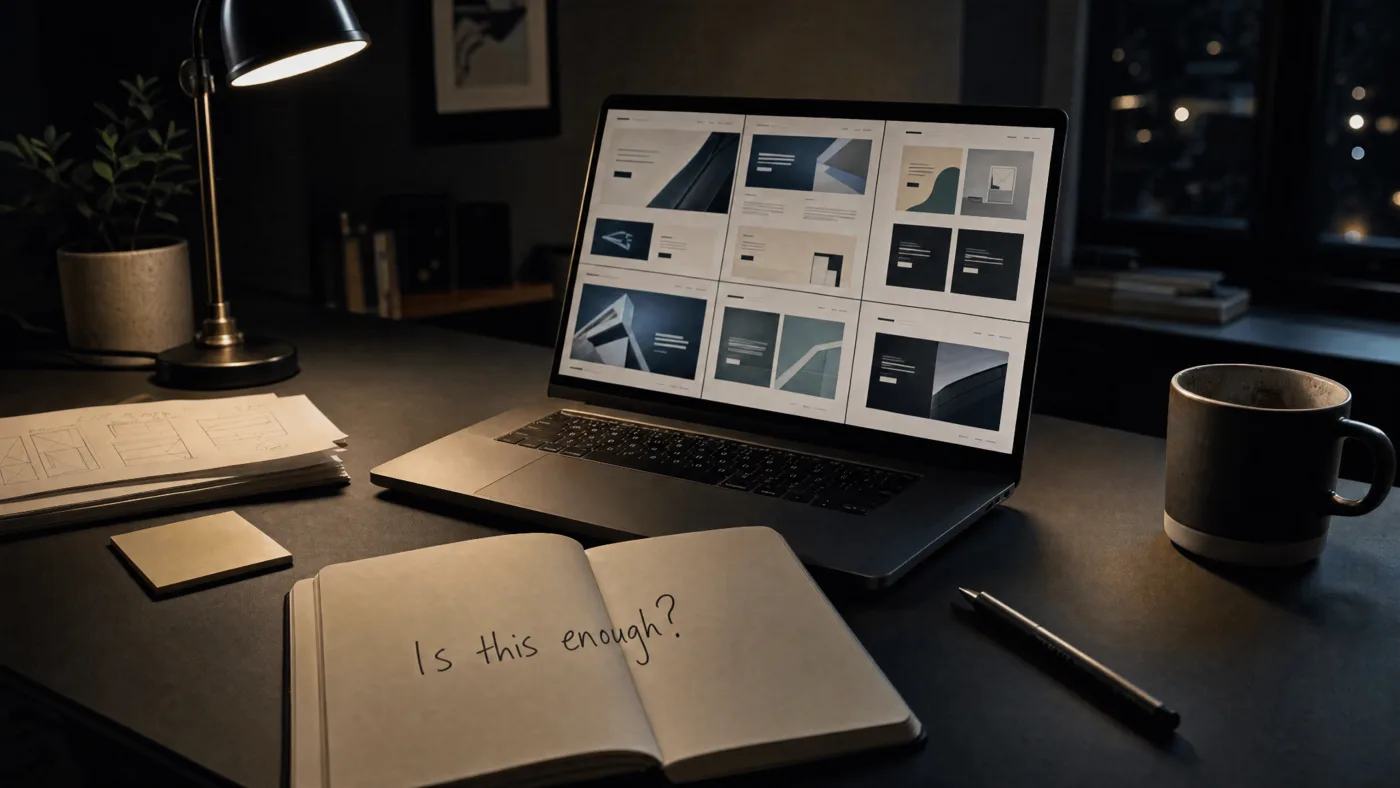
Someone lands on your website.
The hero section is beautiful.
The animation is smooth.
The typography looks expensive.
The colors feel carefully chosen.
For a few seconds, they are impressed.
Then something smaller begins to happen.
They start looking for proof.
Not loudly.
Not consciously.
Not like a checklist.
But somewhere in the back of their mind, questions begin to appear.
“Is this company real?”
“Do they understand my problem?”
“Have they done this before?”
“Will this be worth my time?”
“What happens if I click that button?”
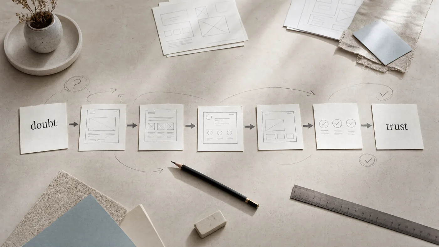
And if your website does not answer those questions, they leave.
Not because your design was ugly.
Because their doubt stayed alive.
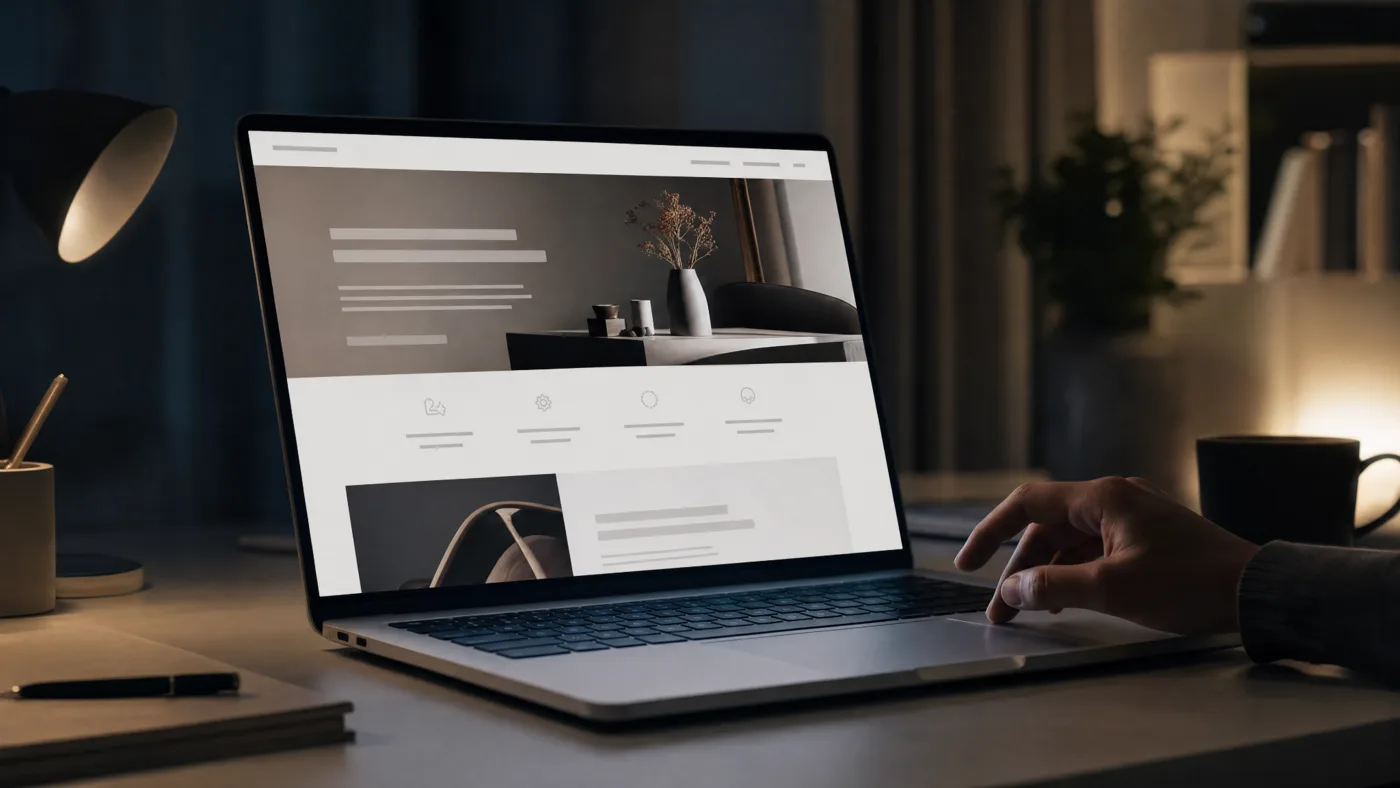
This is where many websites get it wrong.
They try too hard to impress.
Big headline.
Bold promise.
Fancy scroll effect.
Moving shapes.
Beautiful mockups.
Words that sound confident but could belong to any business.
“We help brands grow.”
“We create meaningful experiences.”
“We transform ideas into impact.”
It sounds good.
But after reading it, the visitor still does not know what you actually do, who you do it for, why they should trust you, or what will happen next.
A website can look premium and still feel unclear.
And unclear websites create quiet doubt.
People do not always leave because they dislike you.
Sometimes they leave because you made them think too much.
That is the real job of a website.
Not to shout, “Look how impressive we are.”
But to quietly say, “You are in the right place.”
A good website reduces doubt one section at a time.
The hero should reduce the first doubt:
“What is this, and is it for me?”
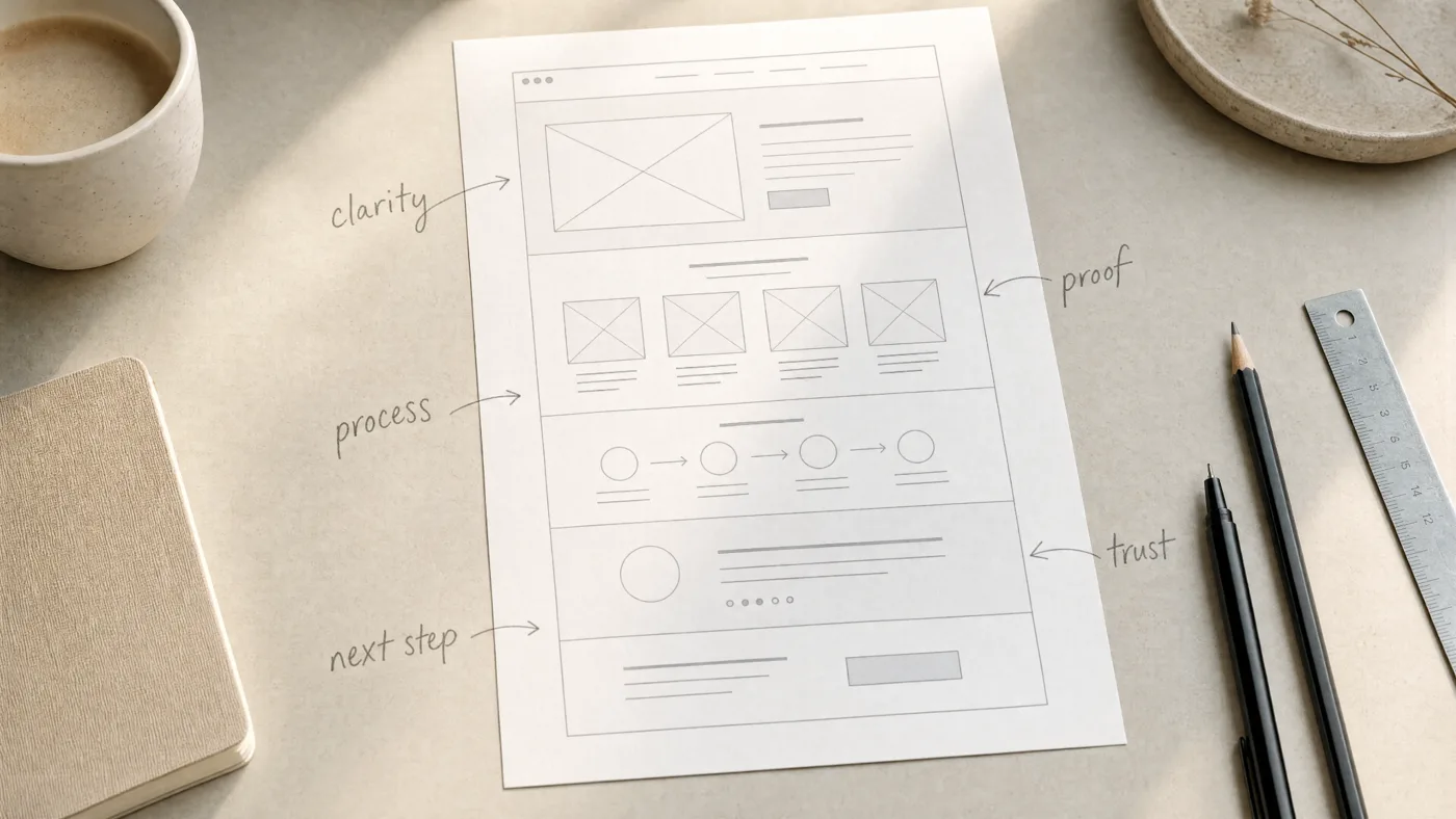
The work section should reduce the next doubt:
“Can they actually do it?”
The process should reduce another:
“What will it feel like to work with them?”
The testimonials should reduce another:
“Did other people trust them and get value?”
The call-to-action should reduce the final doubt:
“What should I do now?”
When these doubts are answered clearly, the visitor does not feel pushed.
They feel guided.
This is why the best websites often feel simpler than average websites.
Not because less effort went into them.
Because more decisions were made.
Someone removed the unnecessary line.
Someone rewrote the vague headline.
Someone moved the proof higher.
Someone made the button clearer.
Someone deleted the clever section that looked nice but did not help the visitor decide.
Good design is not only about what you add.
It is about what you remove so trust can appear faster.
A visitor does not need to know everything about you.
They need to know enough to take the next step without feeling foolish.
That is an important difference.
Many websites are built from the company’s point of view.
“We are creative.”
“We are experienced.”
“We are passionate.”
“We offer many services.”
But the visitor is not reading like that.
The visitor is asking:
“Can you solve my problem?”
“Do you understand my situation?”
“Can I trust you with my money, my time, or my brand?”
The website that wins is not always the loudest one.
It is the one that feels the most clear.
The most specific.
The most honest.
The most aware of the visitor’s hesitation.
Because hesitation is where decisions are lost.
Not at the button.
Before the button.
Long before someone clicks “Book a call,” they have already decided whether the page feels safe enough to continue.
This does not mean your website should be boring.
It should still have beauty.
It should still have personality.
It should still feel like your brand.
But every beautiful thing should have a job.
A great image should create belief.
A strong headline should create clarity.
A smooth interaction should create confidence.
A case study should create proof.
A simple form should create ease.
The goal is not to decorate the doubt.
The goal is to reduce it.
That is what premium really means.
Premium is not just large text and clean spacing.
Premium is when the visitor feels that someone has thought about their fear before they even said it.
That feeling is rare.
And that feeling is powerful.
Because people do not click when they are impressed.
They click when enough doubt has disappeared.
So before you redesign your website, do not only ask, “How can we make this look better?”
Ask:
“What is the visitor still unsure about?”
Then build the page around those answers.
Make the promise clearer.
Make the proof easier to find.
Make the process less mysterious.
Make the next step feel lighter.
Make every section earn its place.
Your website is not a stage.
It is a quiet conversation with someone who has not decided to trust you yet.
And if you do it well, they may not even remember the animation, the layout, or the clever line.
They will only remember that, somewhere while scrolling, the doubt got smaller — and the door felt safe enough to open.
Written by Allgood Studio.
Human-led design, AI-assisted speed, and careful hands for brands, websites, and digital products.