Here is a strange little thrill in watching AI build a website.
You type a few lines.
A brand name.
A service.
Maybe a mood.
“Minimal.”
“Premium.”
“Modern.”
“Apple-inspired.”
“Clean SaaS landing page.”
Then the screen starts moving.
A hero section appears.
A button appears.
A soft gradient appears, because of course it does.
A fake testimonial arrives from a fake customer who is very happy with a product that does not exist yet.
And for a moment, it feels like magic.
The old blank canvas is gone.
The painful first draft is gone.
The part where a founder opens a design file, stares at a white screen, and quietly wonders whether this whole business idea was a mistake — gone.
AI can make a website in minutes now.
That is impressive.
It is also exactly the problem.
A website is not hard because of the pixels.
A website is hard because of the decisions.
The first version is no longer special
For a long time, making something was the bottleneck.
A landing page took time.
A logo took time.
A set of social graphics took time.
A product interface took time.
So the ability to produce was valuable by itself.
If you could open Figma, Photoshop, Webflow, Framer, or a code editor and turn an idea into something visible, that was a serious skill.
It still is.
But something has changed.
Now, almost anyone can generate a first version.
A founder can generate a landing page before breakfast.
A marketer can generate ten campaign directions before a meeting.
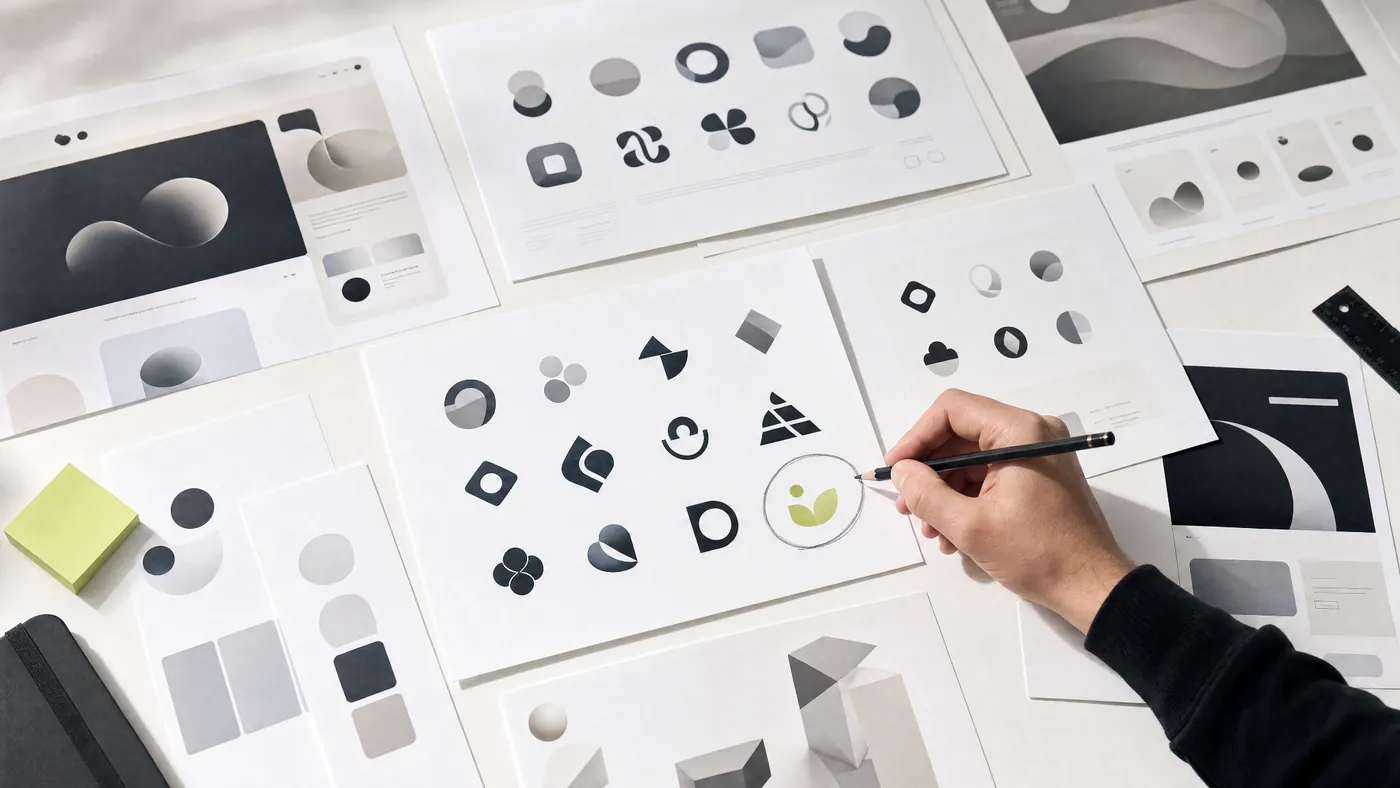
A designer can generate moodboards, icons, layouts, copy blocks, and wireframes without touching the old, slow path.
The machine is getting faster.
But here is the part we do not talk about enough:
When everyone can generate the first version, the first version loses meaning.
It becomes cheap.
Not financially cheap.
Emotionally cheap.
Strategically cheap.
The first version is no longer proof that something is good.
It is only proof that something can be made.
And those are not the same thing.
Good-looking is becoming the new average
This is the uncomfortable truth for design studios, founders, marketers, and anyone trying to build a brand right now:
AI is making bad design look better.
That sounds like progress.
In many ways, it is.
But it also creates a new kind of confusion.
Because the work no longer looks obviously bad.
It has spacing.
It has rounded cards.
It has a gradient blob.
It has a modern sans-serif font.
It has a hero headline with a confident verb.
It has three feature cards, each with a cute icon inside a soft square.
It looks like something.
But often, it does not know what it is trying to say.
This is the new danger.
Not ugly design.
Empty design wearing good clothes.
A website can now look polished and still feel forgettable.
It can look modern and still feel generic.
It can look expensive and still fail to create trust.
The internet is slowly filling with beautiful sameness.
The same hero layouts.
The same startup gradients.
The same glowing dashboards.
The same “seamless experience.”
The same “unlock your potential.”
The same testimonial from someone named Sarah.
The websites are not terrible.
That is what makes it worse.
They are perfectly fine.
Fine is dangerous because it does not ask for change.
Fine sits quietly in the middle of the internet, doing very little harm and very little good.
It does not embarrass you.
It also does not move anyone.
That is why the question has changed.
The old question was:
“Can we make this look good?”
The new question is:
“Can we make this feel true?”
Your website is not a decoration
A lot of people still think of a website as a surface.
A place to put the logo.
A place to list the services.
A place to show some screenshots.
A place to say “we help businesses grow.”
But a good website is not a brochure.
It is a conversation with a person who is already half-distracted.
That person may be a founder.
A buyer.
A hiring manager.
An investor.
A client who has seen five similar options today.
They are not reading your homepage with patience and generosity.
They are scanning.
They are looking for proof.
Do these people understand my problem?
Do they feel credible?
Is this for someone like me?
Is this worth my time?
Will I regret contacting them?
This is why a website is not mainly a design problem.
It is a trust problem.
Design is just how that trust becomes visible.
The spacing matters because it tells the visitor whether you are calm or desperate.
The copy matters because it tells them whether you understand their world or are repeating internet words.
The hierarchy matters because it tells them whether you know what is important.
The visuals matter because they tell them whether your taste can be trusted.
The motion matters because it tells them whether you have restraint.
The small things are not small.
They are signals.
And people read signals faster than they read paragraphs.
AI gives you options. It does not give you judgment.
This is where people get fooled.
They ask AI for a homepage.
AI gives them one.
They ask for a more premium version.
AI gives them a darker background, bigger type, more spacing, maybe a glass effect.
They ask for something “Awwwards-style.”
AI adds motion, large typography, floating objects, and a mysterious abstract image.
Everything feels like progress.
But progress toward what?
That is the question.
AI is very good at answering the question you asked.
It is not always good at noticing that you asked the wrong question.
You ask for a premium website.
But maybe your problem is not premium.
Maybe your problem is clarity.
You ask for more animation.
But maybe your page already feels too busy.
You ask for a better hero section.
But maybe your offer is still vague.
You ask for a cleaner layout.
But maybe your copy has no point of view.
This is the difference between production and direction.
Production asks:“How do we make this?”
Direction asks:“What should this become?”
AI is getting very good at production.
But direction still needs taste, context, courage, and care.
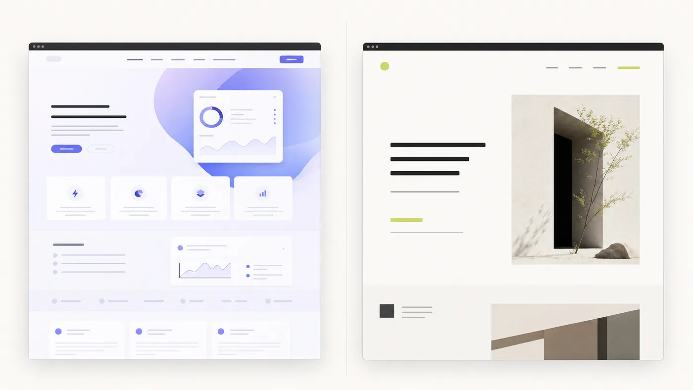
Average websites explain. Better websites reduce doubt.
Here is a simple way to look at it.
Average websites explain what a company does.
Better websites help the visitor believe it.
Average websites show services.
Better websites show judgment.
Average websites say “we are different.”
Better websites behave differently.
Average websites add more sections when the message feels weak.
Better websites sharpen the message until fewer sections are needed.
Average websites use motion to impress.
Better websites use motion to guide attention.
Average websites are built from components.
Better websites are built from decisions.
This is why two websites can have the same sections and feel completely different.
Hero.
Services.
Process.
Work.
Testimonials.
Contact.
The structure can be identical.
But one feels like a template.
The other feels like a company that knows itself.
The difference is not the section list.
The difference is the thinking inside the section.
What AI cannot see from the prompt
A prompt can describe a style.
It can say:
“Clean.”
“Premium.”
“Luxury.”
“Minimal.”
“Bold.”
“Friendly.”
“Modern.”
“Human.”
But these words are slippery.
One person’s premium is another person’s empty.
One person’s bold is another person’s loud.
One person’s minimal is another person’s unfinished.
This is why design cannot live only inside a prompt.
A prompt does not know the hesitation in your client’s mind.
It does not know that your audience is tired of being sold to.
It does not know that your product needs to feel safer, not cooler.
It does not know that your brand should sound less like a startup and more like a trusted partner.
It does not know that your founder story has one sentence inside it that is more powerful than the entire homepage.
It does not know which detail matters.
A good designer listens for that detail.
Sometimes it is buried in a client call.
Sometimes it is hidden in a messy document.
Sometimes it appears when the client says, “This may not be important, but…”
Usually, that is the important part.
AI can generate from what you give it.
Good design often comes from noticing what was missing.
The new design skill is not making. It is choosing.
When tools become powerful, people assume the work becomes easier.
Sometimes it does.
But often, the difficulty moves.
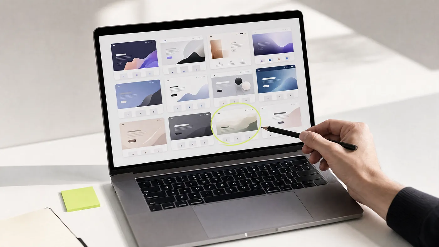
Before, the hard part was creating enough options.
Now, the hard part is surviving them.
You can generate fifty hero sections.
But which one is right?
You can generate twenty logo marks.
But which one has memory?
You can generate ten brand voices.
But which one feels honest?
You can generate an entire website.
But which parts should not be there?
This is where many projects start to go wrong.
The team keeps generating.
More versions.
More references.
More styles.
More ideas.
But the work does not get better.
It only gets wider.
At some point, good design requires a small, painful sentence:
“No, not that.”
Not because it is bad.
Because it is not right.
That is taste.
Taste is not decoration.
Taste is disciplined refusal.
It is the ability to look at something attractive and still say:
“This is not us.”
“This is too much.”
“This is too generic.”
“This is clever, but not useful.”
“This looks premium, but it does not feel trustworthy.”
AI can help you make.
But someone still has to choose.
Why speed needs care
At Allgood Studio, we use AI.
Not as a replacement for thinking.
As a way to protect more time for thinking.
That distinction matters.
In the past year, we have seen the same pattern again and again.
The first draft arrives faster than ever.
But the real conversation still begins with the old, difficult questions:
Who is this for?
Why should they trust it?
What should they remember?
What should we remove?
What is the one thing this page must make clear?
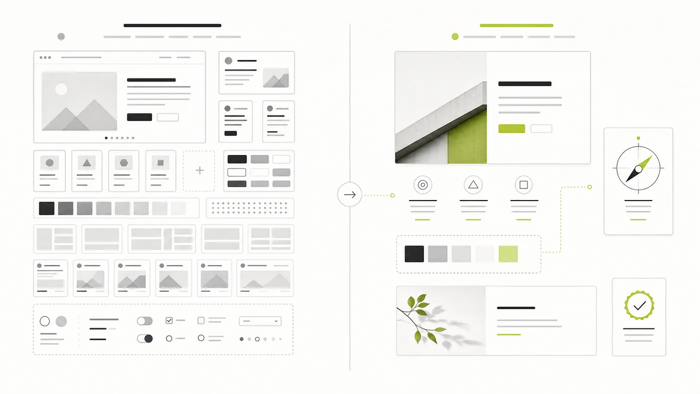
AI can help us explore directions faster.
It can help us test visual systems.
It can help us shape copy drafts.
It can help us build early layouts.
It can help us move from idea to prototype without wasting days on mechanical work.
That is useful.
Very useful.
But speed is not the goal by itself.
A fast wrong answer is still wrong.
A fast generic website is still generic.
A fast brand that sounds like everyone else is not a brand.
It is camouflage.
The real value of speed is not that we can skip care.
The real value is that we can spend care where it matters most.
On the idea.
On the message.
On the first impression.
On the order of information.
On the feeling of trust.
On the small details that make the work feel considered.
Human-led. AI-speed.
Not AI-led, human-corrected.
There is a difference.
A website should not feel generated. It should feel understood.
That is the standard now.
Not “does it look modern?”
That bar is too low.
The better questions are:
Does it understand the audience?
Does it make the offer clearer?
Does it reduce doubt?
Does it sound like a real company?
Does it know what to leave out?
Because AI can make a website in minutes.
But a website worth launching still needs more than minutes.
It needs taste.
It needs editing.
It needs a point of view.
It needs someone to care enough to ask why this section exists, why this sentence matters, why this button is here, why this visual feels right, why the whole thing should be believed.
The blank canvas may be gone.
But the real work is still here.
And maybe that is a good thing.
Because the goal was never just to make a website.
The goal was to make someone feel, quietly and quickly:
“These are the right people.”
Written by Allgood Studio.
Human-led design, AI-assisted speed, and careful hands for brands, websites, and digital products.