There is a quiet embarrassment that comes with having too many options.
No one talks about it much.
We talk about the power of choice.
The freedom of choice.
The magic of choice.
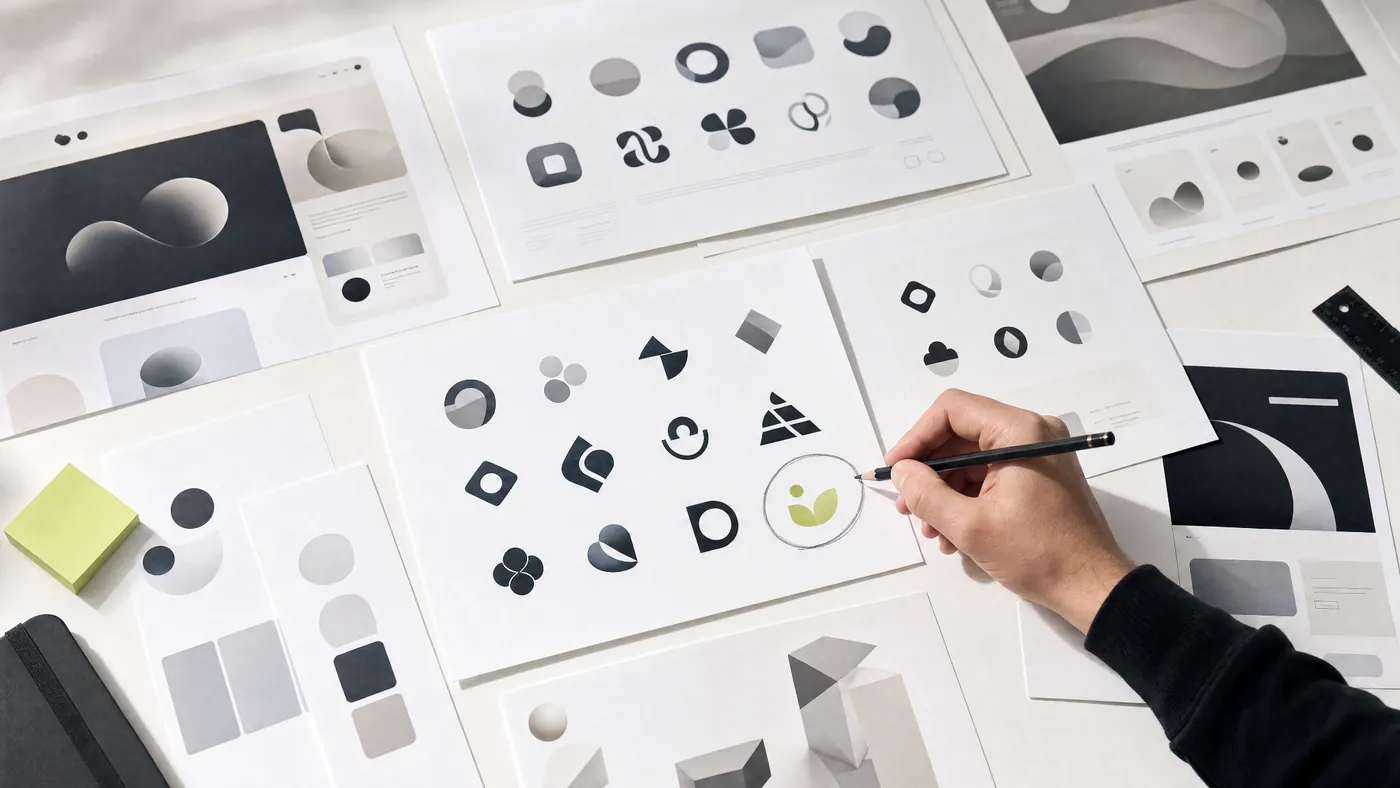
But anyone who has spent an afternoon looking at fifty AI-generated logo concepts knows the truth.
Choice can be exhausting.
At first, it feels wonderful.
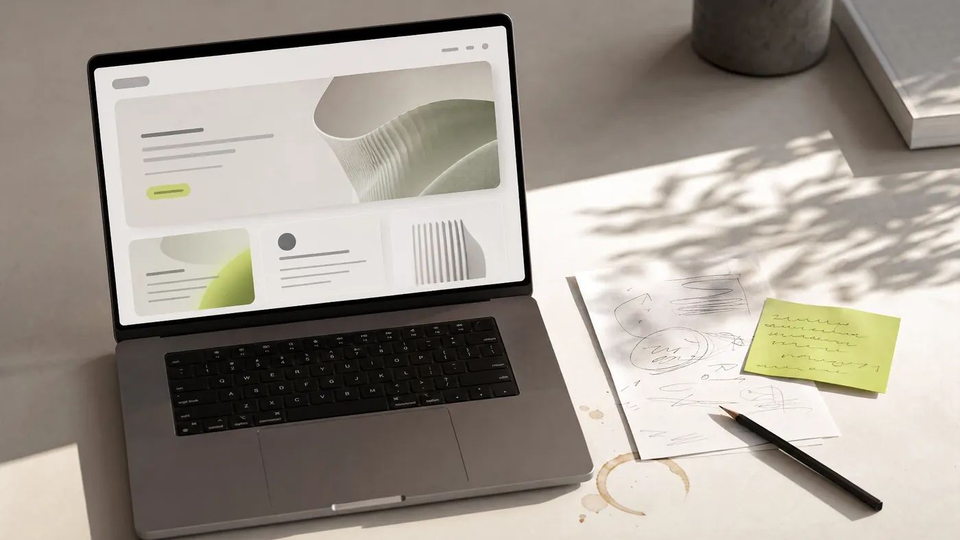
You ask for a brand identity.
The machine gives you ten.
Then twenty.
Then fifty.
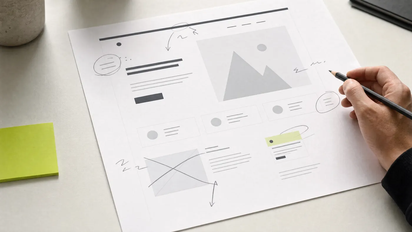
You ask for a homepage.
It gives you a clean one.
A bold one.
A luxury one.
A playful one.
A futuristic one.
A “make it more premium” one, which usually means more black, more spacing, and a mysterious glowing object.
You ask for a product dashboard.
It gives you cards.
Charts.
Sidebars.
Filters.
Buttons.
Empty states.
All of them polite.
All of them usable-looking.
All of them somehow familiar.
And then the real problem begins.
Not “can we make something?”
We can.
Not “can we make many things?”
We definitely can.
The problem is much quieter.
Which one is right?
The tools got better. Our eyes did not automatically improve.
AI has made design feel strangely available.
A founder can generate a landing page without hiring a designer.
A marketer can create campaign visuals without opening Photoshop.
A student can produce a brand board in ten minutes.
A designer can explore more directions in one morning than they used to explore in a week.
This is real progress.
It would be dishonest to pretend otherwise.
The tools are useful.
Fast.
Generous.
Sometimes surprising.
But tools have a way of flattering us.
Give someone a better camera, and suddenly every photo looks more professional.
For a while.
The colors are richer.
The background is blurrier.
The face is sharper.
The image feels expensive.
But after a few minutes, you can still tell.
Some people are taking pictures.
Some people are seeing.
Design is becoming like that.
The tools can make the surface better.
But they do not automatically make the eye better.
They do not teach you what to remove.
They do not teach you why one layout feels honest and another feels desperate.
They do not teach you when something is beautiful but wrong.
They do not teach you when a clever idea should be quietly deleted.
That is taste.
And taste is not included in the subscription.
Taste is not “making things look nice”
This is where the word gets misunderstood.
People hear “taste” and think it means style.
Nice colors.
Good fonts.
Premium spacing.
A certain kind of restraint.
A clean Instagram grid.
A home with expensive chairs and no visible cables.
But taste is deeper than preference.
Taste is not simply liking beautiful things.
A person can like beautiful things and still make weak decisions.
Taste is the ability to sense what belongs.
It is knowing when a page needs more emotion and when it needs less decoration.
It is knowing when a brand should feel softer, even if the trend says bold.
It is knowing when a button should be louder because the user is lost.
It is knowing when a section should disappear because it exists only to make the page feel longer.
Taste is not a moodboard.
Taste is judgment under pressure.
Because in real design work, the question is rarely:
“Is this nice?”
The question is usually:
“Is this right for this brand, this audience, this moment, this problem, this budget, this launch, this promise?”
That is harder.
That requires context.
AI can show you what is possible.
Taste helps you decide what is appropriate.
Good taste often looks boring at first
This is the funny part.
Bad taste often announces itself.
It wants you to notice the gradient.
The animation.
The huge headline.
The strange 3D shape.
The unnecessary glass effect.
The button that glows like it has discovered electricity.
Good taste is quieter.
Sometimes it looks almost too simple.
A better line break.
A little more space before the CTA.
A softer word in the headline.
A removed icon.
A calmer color.
A smaller claim.
A more honest image.
A section moved higher because trust should arrive before explanation.
These are not loud decisions.
But they change how the whole thing feels.
A website can go from “trying to impress me” to “I trust these people” because of a handful of quiet choices.
That is why good taste is easy to underestimate.
It does not always look like more.
Often, it looks like less.
Less noise.
Less pretending.
Less decoration.
Less nervousness.
The work becomes stronger because it stops trying so hard.
AI is making average taste look expensive
This might be the biggest shift.
In the past, weak taste was easier to spot.
The typography was messy.
The alignment was off.
The colors fought each other.
The layout felt broken.
The stock photo looked like it had been chosen by someone in a hurry.
Now the work is smoother.
AI can create design that looks balanced enough.
It understands the popular shapes of modern design.
Hero section.
Big headline.
Rounded image.
Soft background.
Three feature cards.
A floating dashboard.
A clean footer.
Maybe a subtle gradient, because apparently the internet signed a secret agreement about gradients.
The result can look professional.
But professional is not the same as memorable.
Polished is not the same as persuasive.
Modern is not the same as meaningful.
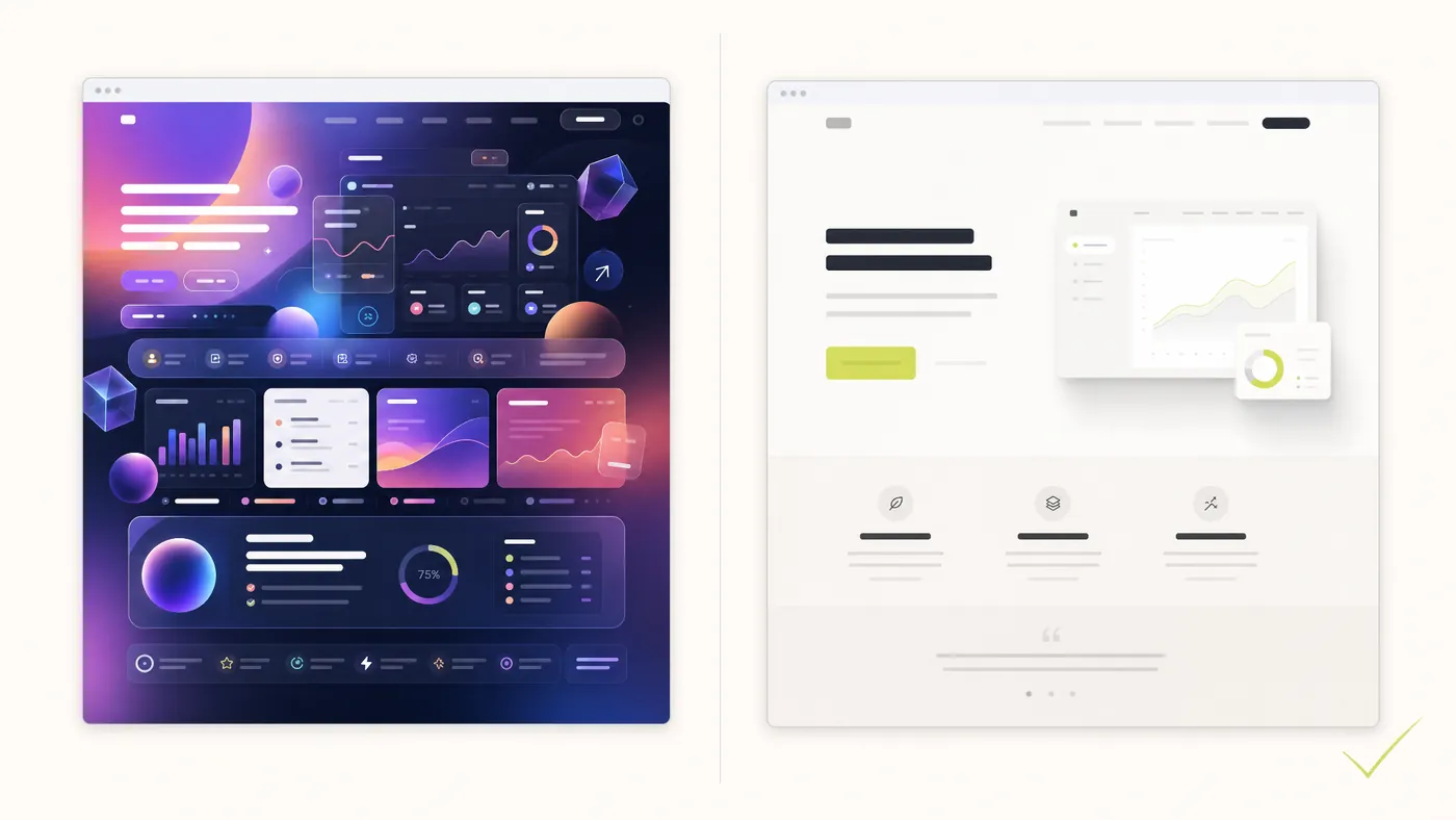
This is the dangerous middle.
The work is not bad enough to reject.
But it is not strong enough to remember.
It passes the first glance.
Then disappears.
And for most brands, disappearing is the real failure.
Taste is the courage to disappoint the wrong person
Every project has a moment where taste becomes uncomfortable.
At first, everyone wants something good.
That part is easy.
But eventually, good design asks for a tradeoff.
Make the homepage calmer, and someone will say it feels too empty.
Make the copy sharper, and someone will say it sounds too direct.
Remove three sections, and someone will ask where all the content went.
Choose one clear direction, and someone will wonder if we should “explore a few more options.”
This is where taste becomes courage.
Because good design is not just choosing what you like.
It is choosing what the work needs.
Sometimes that means disappointing the person who wants more.
More color.
More movement.
More features.
More proof.
More cleverness.
More everything.
But more is not always more.
Sometimes more is fear.
Fear that the idea is not strong enough.
Fear that the visitor will not understand.
Fear that the page will feel empty.
Fear that simplicity will be mistaken for lack of effort.
So we add.
And add.
And add.
Until the work is protected from silence but also protected from clarity.
Taste knows when to stop.
The best designers are not better because they see more. They are better because they notice differently.
A good designer does not only look at the screen.
They look at the hesitation behind the screen.
Why does this section feel untrustworthy?
Why does this headline sound correct but lifeless?
Why does this layout feel premium but cold?
Why does this button feel too early?
Why does this testimonial feel fake even if it is real?
Why does the page have a lot of information but no conviction?
These are taste questions.
They are not always easy to explain at first.
Sometimes the designer only knows something is off.
Then they follow the discomfort.
They move the headline.
They rewrite one sentence.
They remove the icon.
They change the image crop.
They make the CTA less aggressive.
They let the page breathe.
Suddenly, the work starts to feel right.
Not because it became more decorative.
Because it became more truthful.
That is the part AI struggles with.
Not because AI is useless.
Because AI does not feel discomfort the way a person does.
It does not sit with the awkwardness of a brand that wants to sound premium but has no proof yet.
It does not notice that the client keeps using one phrase in conversation that is better than everything in the brief.
It does not feel when a layout is technically good but emotionally wrong.
It can imitate the shape of taste.
But it does not carry the burden of judgment.
Taste is built by looking longer than necessary
There is no shortcut here.
Taste comes from exposure.
From looking at good work.
Bad work.
Almost-good work.
Work that won awards.
Work that quietly converted customers.
Work that looked beautiful but failed.
Work that looked simple but carried a whole business.
It comes from asking why.
Why does this feel expensive?
Why does this feel generic?
Why does this headline create trust?
Why does this layout feel calm?
Why does this animation feel annoying?
Why does this brand feel like it knows itself?
Most people scroll.
Designers have to look.
Not glance.
Look.
Long enough to notice the relationship between things.
The space between a heading and a paragraph.
The weight of a word.
The confidence of leaving something out.
The difference between a strong idea and a fashionable surface.
AI can generate references.
But taste comes from studying them.
Slowly.
With attention.
With a little suspicion.
Because not everything beautiful is good.
And not everything simple is thoughtful.
Everyone can generate. Not everyone can edit.
Editing is where taste becomes visible.
The first draft says:
Here are all the possibilities.
Editing says:
This one.
Not that one.
Less of this.
More of that.
Remove this.
Move this up.
Make this quieter.
Make this braver.
Say the actual thing.
Stop hiding behind the stylish thing.
This is true for writing.
It is true for design.
It is true for branding.
The first version is usually full of energy.
But it is also full of lies.
Small lies.
Harmless-looking lies.
The line that sounds good but says nothing.
The image that looks premium but belongs to no one.
The layout that feels current but does not help the visitor.
The animation that exists because someone discovered how to do it.
Editing removes the lies.
Not all at once.
Carefully.
Until the work starts to stand on its own.
This is why the final 10% of design can feel strangely slow.
The obvious problems are gone.
Now only the subtle ones remain.
And subtle problems require taste.
AI did not make designers unnecessary. It made weak judgment easier to see.
There is a fear in the design industry right now.
Some of it is reasonable.
When tools become faster, some parts of the work become less valuable.
Basic production will become cheaper.
Generic layouts will become easier.
Simple assets will become faster.
First drafts will become expected.
That is real.
But the answer is not to pretend nothing changed.
The answer is to move up the value chain.
To become better at the things the tool cannot responsibly own.
Strategy.
Positioning.
Hierarchy.
Narrative.
Restraint.
Client understanding.
Taste.
The designer who only makes things may feel threatened.
The designer who knows what should be made becomes more valuable.
Because now the world has more output than ever.
What it needs is not more.
It needs better judgment.
At Allgood Studio, taste means care
We use AI in our process.
Gladly.
It helps us move faster.
Explore quicker.
Sketch earlier.
Test directions before wasting time.
Turn rough thinking into something visible.
But we do not treat AI output as the answer.
We treat it as material.
Raw material.
Sometimes useful.
Sometimes interesting.
Sometimes completely wrong in a way that teaches us something.
The work still has to pass through human judgment.
Is it clear?
Is it honest?
Is it useful?
Is it specific?
Is it calm enough?
Is it memorable enough?
Is it trying too hard?
Does it feel like the brand, or just like the internet?
That is where care lives.
Not in rejecting tools.
In refusing to let tools flatten the work.
Human-led.
AI-assisted.
Not because it sounds nice.
Because that is where the best work now happens.
Between speed and restraint.
Between possibility and taste.
Between what can be made and what should be made.
The future will not belong to people with the most tools
Everyone will have tools.
That is the point.
The advantage will not be access.
It will be discernment.
The ability to look at ten good options and pick the honest one.
The ability to see when something is polished but empty.
The ability to protect the work from becoming louder than it needs to be.
The ability to make something feel specific in a world full of generated sameness.
AI has made creation easier.
But it has not made taste automatic.
Maybe it never will.
Because taste is not just about beauty.
It is about attention.
Memory.
Restraint.
Context.
Care.
It is knowing what belongs.
And in a world where everyone can make almost anything, that may become the rarest skill of all.
Written by Allgood Studio.
Human-led design, AI-assisted speed, and careful hands for brands, websites, and digital products.