A founder once sent a website and asked, “What do you think?”
I opened it.
At first, it looked beautiful.
Big confident headline.
Smooth animation.
Soft gradients.
Perfect spacing.
Expensive-looking mockups.
The kind of website that makes you pause for a second and think, “This looks serious.”
So I scrolled.
Then I scrolled again.
And somewhere around the third section, I realized something strange.
I still did not know what the company actually did.
That is one of the quietest ways a website can fail.
Not by looking bad.
That would be easier to notice.
It fails by looking perfect and saying nothing.
A lot of modern websites have this problem now.
They know how to look premium.
They know the right layout.
The right type size.
The right motion.
The right hero image.
The right rounded cards.
The right soft shadows.
Everything is in place.
But the meaning is missing.
You read the headline, and it sounds nice.
You read the paragraph, and it sounds confident.
You scroll through the sections, and everything feels polished.
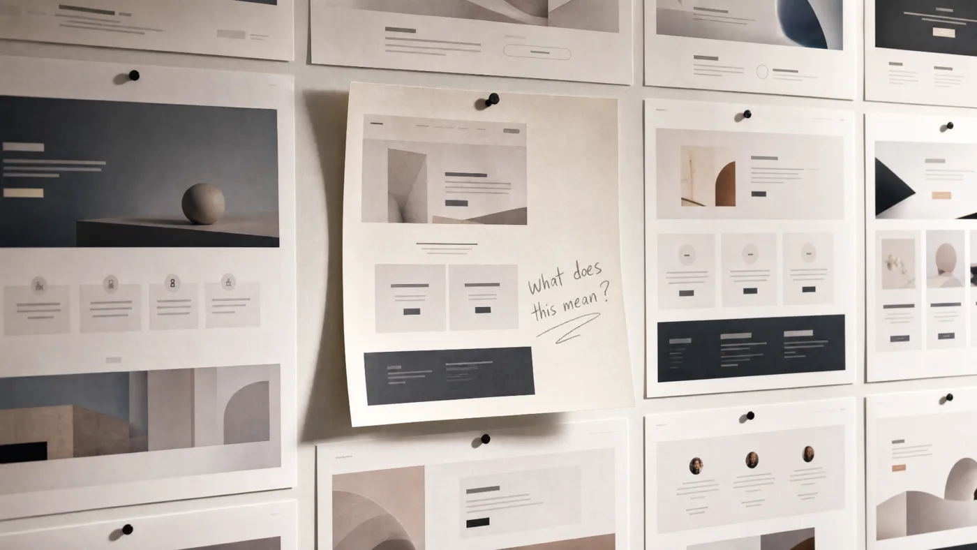
But after all of it, one simple question is still unanswered:
“Why should I care?”
That is the dangerous part.
A website can have many words and still say nothing.
It can say “innovation.”
It can say “growth.”
It can say “impact.”
It can say “meaningful experiences.”
It can say “we transform ideas.”
But if the visitor does not understand who you help, what problem you solve, why you are different, or what they should do next, the website is only decorating confusion.
This happens because many websites are designed from the inside out.
The company wants to look impressive.
So the website becomes a mirror.
It reflects ambition.
It reflects taste.
It reflects how the team wants to be seen.
But a good website is not only a mirror.
It is also a window.
The visitor should be able to look through it and see something clearly:
“This is for me.”
“They understand my problem.”
“They have done this before.”
“I know what happens next.”
“I can trust them enough to continue.”
That is the real job.
Not just beauty.
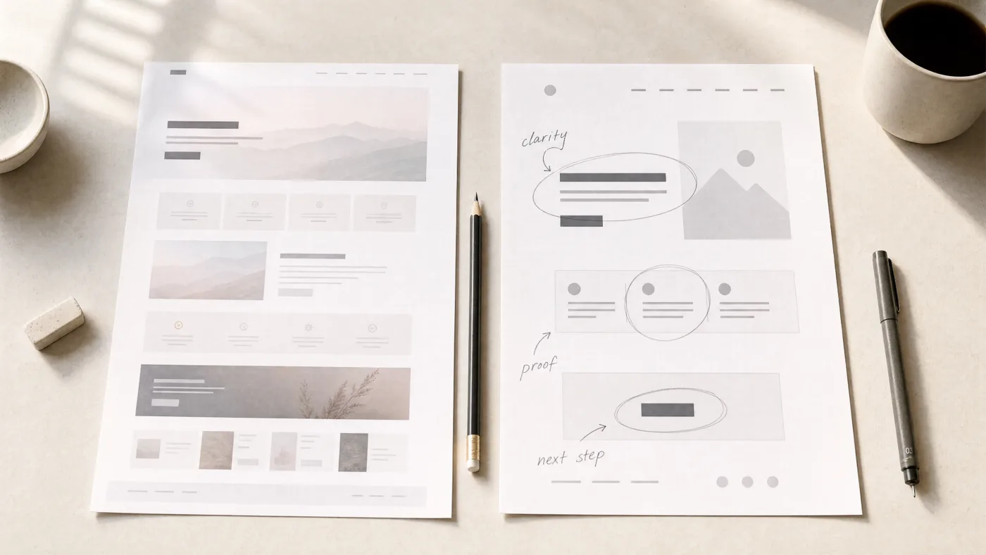
Clarity.
Beauty opens the door.
Clarity invites someone in.
The problem with a perfect-looking empty website is that it creates a strange kind of distance.
The visitor admires it, but does not connect.
They may think the design is nice.
They may like the animation.
They may even scroll longer than usual.
But admiration is not the same as trust.
And attention is not the same as action.
People do not contact you because your spacing was good.
They contact you because enough of their doubt has disappeared.
This is why perfect design can sometimes hide weak thinking.
A vague headline looks better in large type.
A weak message feels stronger with animation.
A generic service sounds more premium with the right layout.
But polish does not fix emptiness.
It only makes emptiness harder to question.
A better website does not need to shout.
It needs to say the right things clearly.
What do you do?
Who is it for?
Why does it matter?
Why should someone believe you?
What should they do after they believe you?
These questions sound basic.
That is exactly why they are often skipped.
Teams jump too quickly into style.
They ask:
“How can we make this look premium?”
“How can we make the hero more impressive?”
“How can we add more motion?”
“How can we make this feel like a big brand?”
Those are not bad questions.
But they should come after the harder ones.
“What are we actually trying to say?”
“What doubt are we removing?”
“What should the visitor remember?”
“What would make this feel true instead of just polished?”
Because when the message is clear, design becomes stronger.
The layout has a reason.
The motion has restraint.
The visuals support belief.
The copy carries weight.
Nothing is just there to look nice.
Everything has a job.
That is when a website starts to feel alive.
Not because it has more effects.
Because it finally has a point of view.
The best websites are not always the loudest, most animated, or most visually perfect.
They are the ones that leave you with a sentence you can remember.
A simple truth.
A clear promise.
A feeling that the company knows exactly who it is speaking to.
That is what most perfect websites are missing.
They look finished.
But they do not feel decided.
And visitors can sense that.
They may not explain it.
They may not complain.
They may not even know what was missing.
They will just close the tab.
Not angry.
Not disappointed.
Just unconvinced.
The website looked beautiful.
The visitor waited for it to say something.
And after a long, quiet scroll, it never did.
Written by Allgood Studio.
Human-led design, AI-assisted speed, and careful hands for brands, websites, and digital products.